


Data analysts can and should be creative. Creative in seeking unique insights. Creative in their design abilities, and creative in telling stories using data. The Analyst’s Toolkit is a set of courses, templates, and visual guides that enhance the skills of the average analyst.
Find your creative skillset...
The Analyst’s Toolkit
Templates, guides, grids, and icons...
Creative Design Assets »


Learn visualization and storytelling skills...
« Beautiful Courses in Data Design
Two courses and two design assets...
The Analyst’s Toolkit

Want to show up in the top 10% of analysts? To raise your skills to the next level, you only need two courses. Add our best Power BI theme, templates, & data visualization style guide.
Each course and each design asset is available for individual sale. Buy all four as our Analyst’s Toolkit bundle now and get huge savings!
Sale
An Introduction to Data Visualization and Storytelling Course
Original price was: $181.00.$125.00Current price is: $125.00.
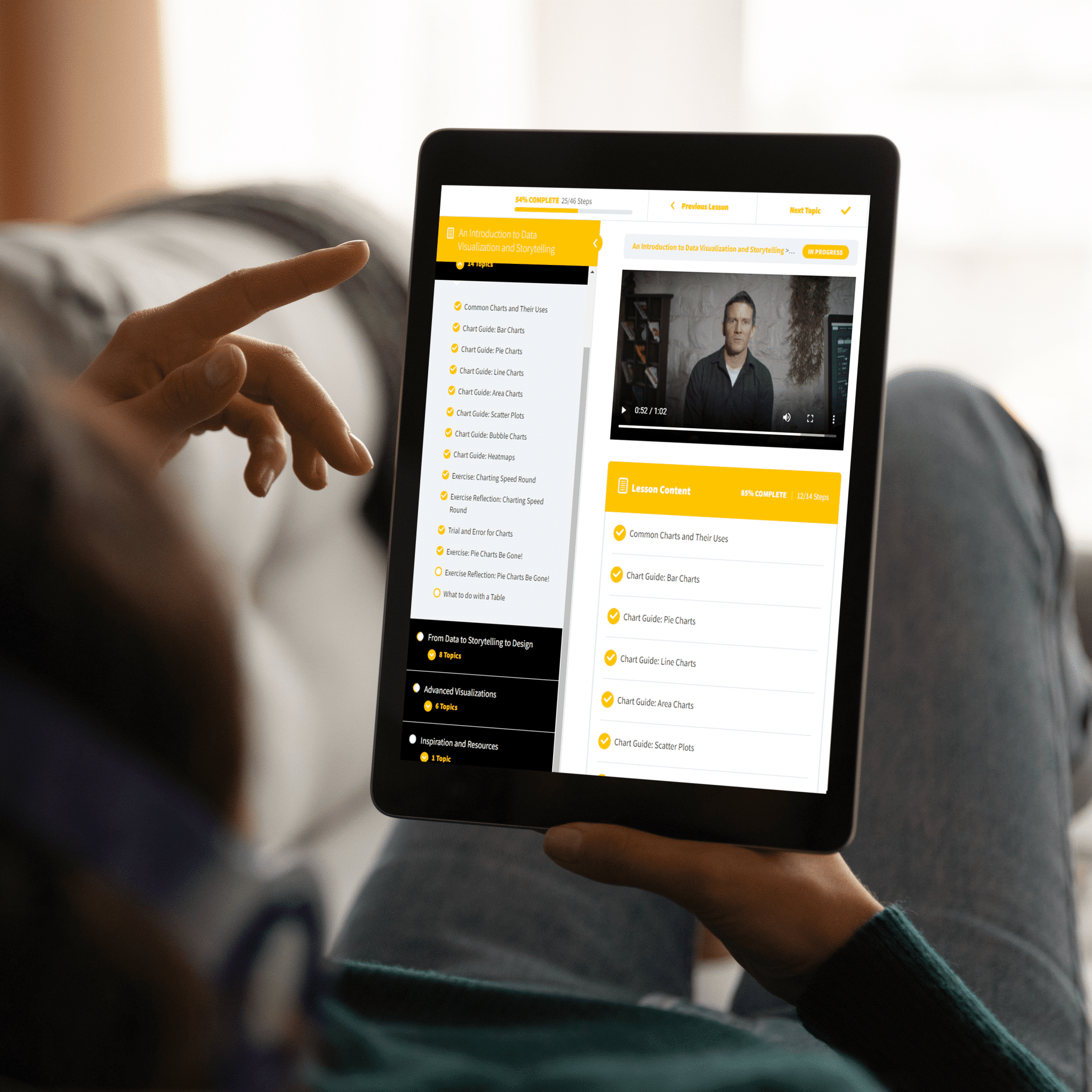

Sale
Designing Great Dashboards Course
Original price was: $181.00.$125.00Current price is: $125.00.


• 40 templates
• 2 video courses
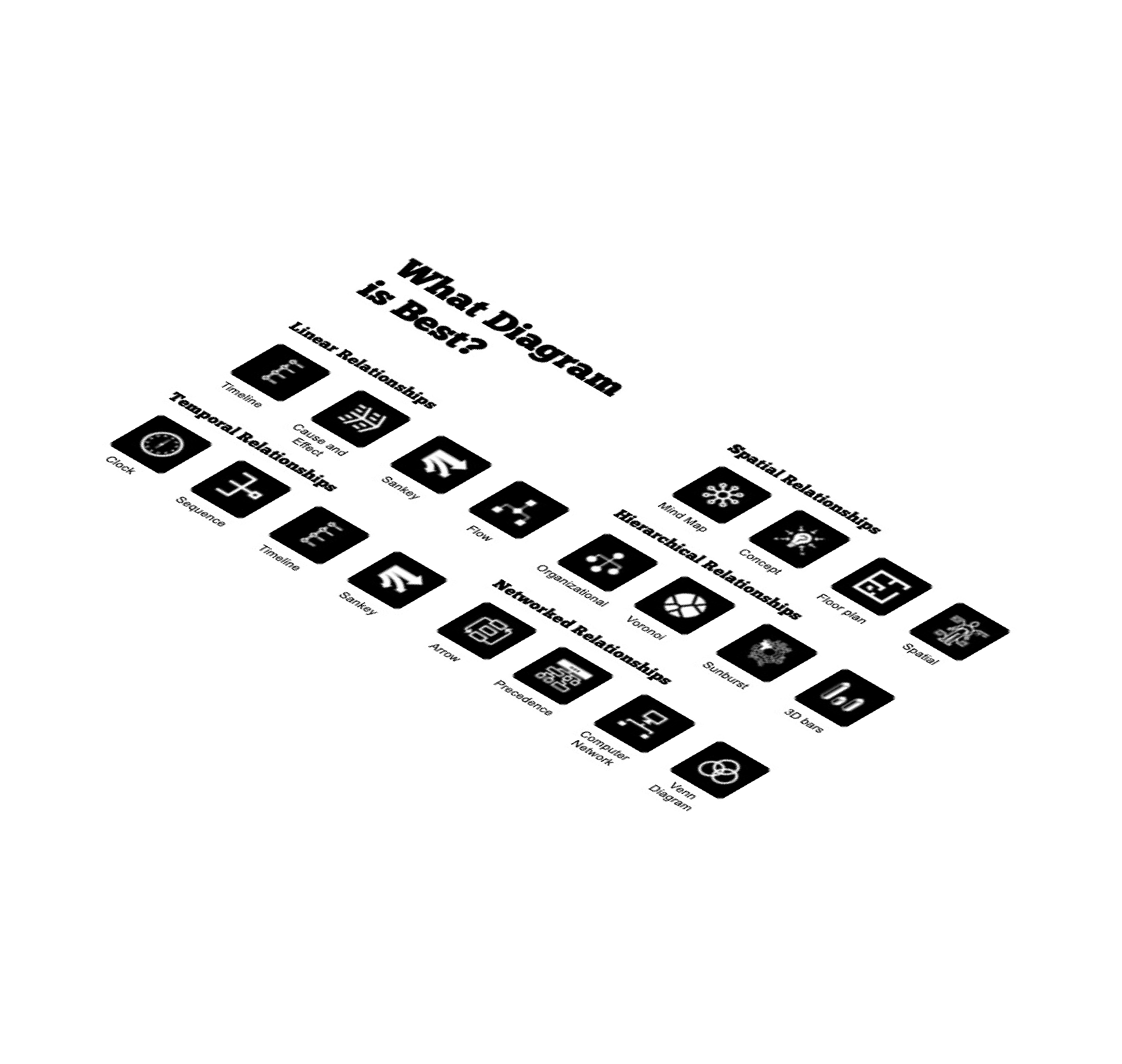
• 38+ dashboard icons
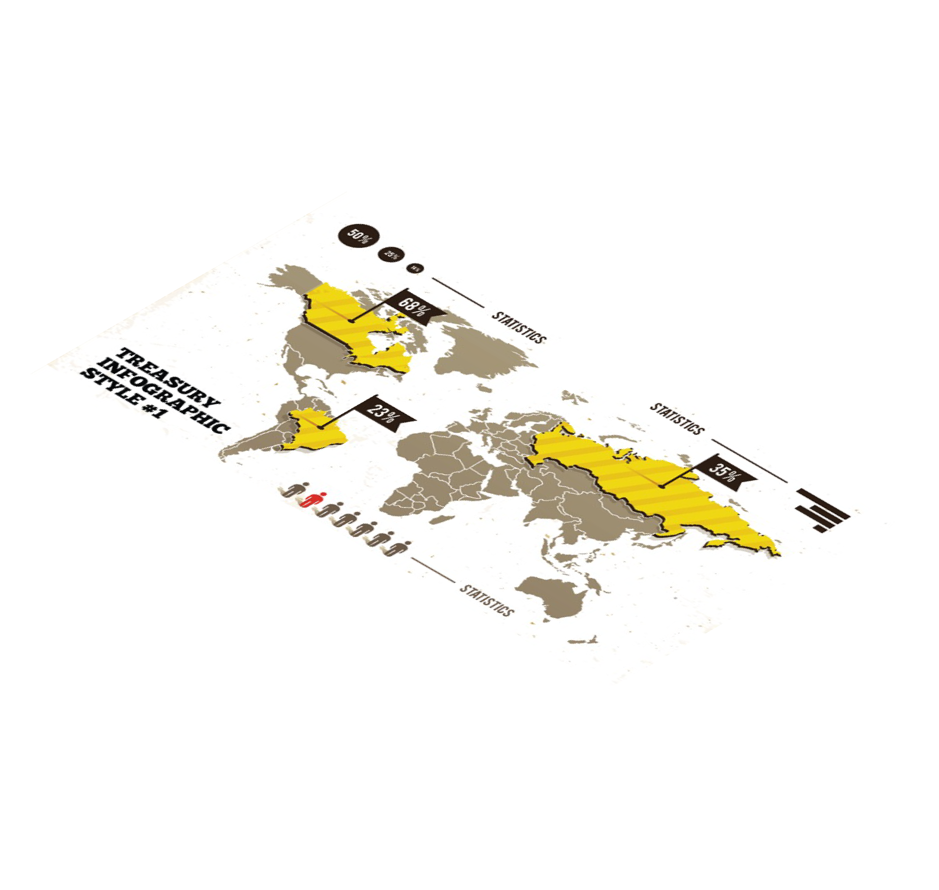
• 30+ styled charts
• 80-page style guide
• 3 .PBIX Files
Global audience, global customers
WHAT OUR CLIENTS SAY
The Datalabs Agency designed its first interactive dashboard system in 2011. Since then, we’ve been designing interactive data visualizations and business intelligence dashboards for hundreds of clients.
Below are a few of our recent clients we’ve upskilled with the Analyst’s Toolkit.





Data analysts need...guides and grids.the freedom to find their own style.both creativity and structure.templates and training.

Let's cut to the chase...
Advantages for Work
Whoever told you that design is NOT important in data science is wrong. You, as an analyst, will be judged on your reports and your ability to tell memorable stories with data.

Freedom and structure...
Creativity Can Be Learned
The Datalabs Agency teaches in an easy-to-understand, visual way. We never fit in with traditional business intelligence consultancies. The art of data has always been important to us.
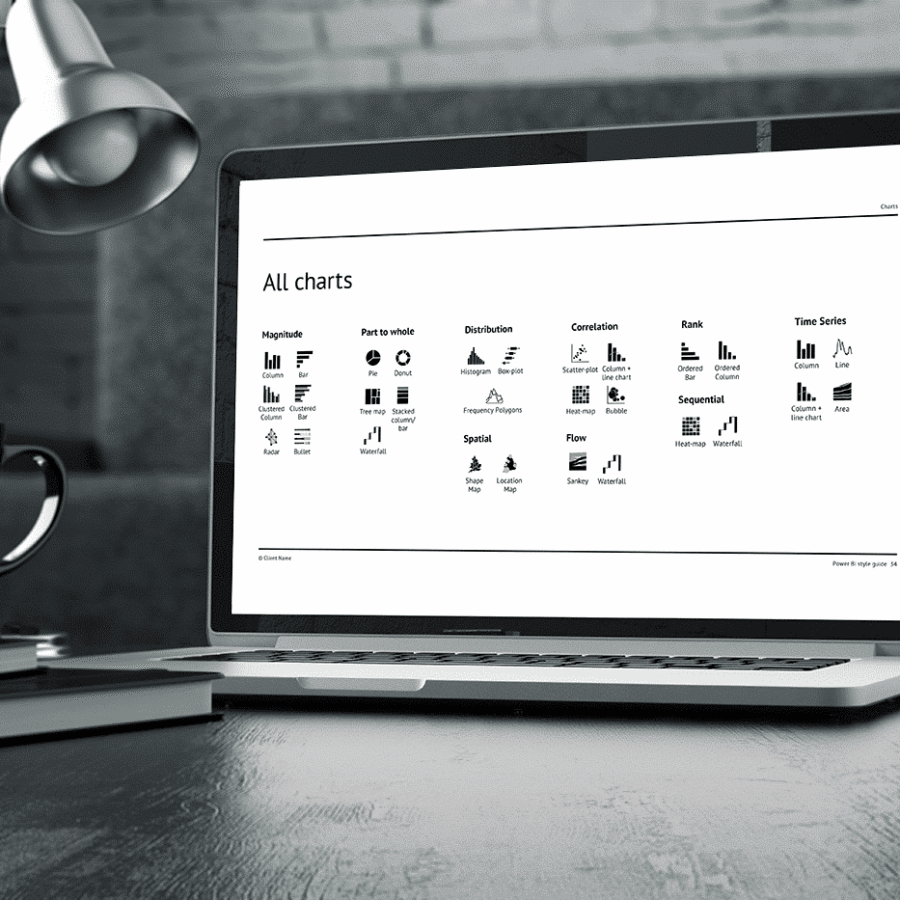
Keep it a secret...
Start with the Best BI Design Assets
Imagine your boss’s or client’s face when they see your next dashboard. When they look for insights and a story in your next report. Having the best designs and training is gonna get you to that next level of confidence.
Enjoy being an artist and storyteller...
Easy-to-Apply to Projects Now
The key to being creative is having time to be creative. The Analyst’s Toolkit saves time and helps intelligent analysts — analysts who have told themselves that they are ‘not creative’ or that they ‘suck at design’. Get excited for training that you can apply immediately and designs you can show in your next meeting.

Build your speed-to-insight skills...
Design Dashboards Faster »

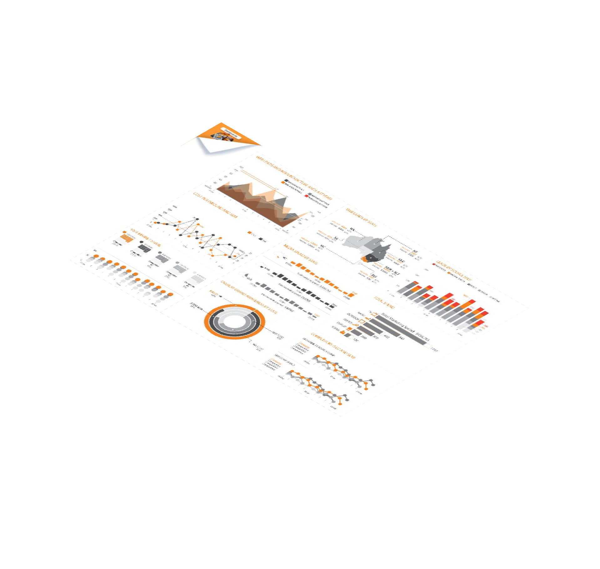
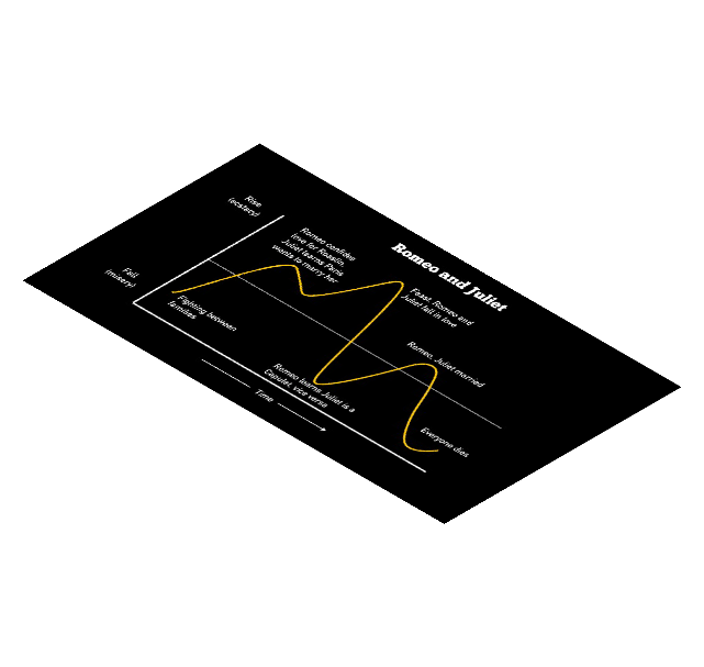
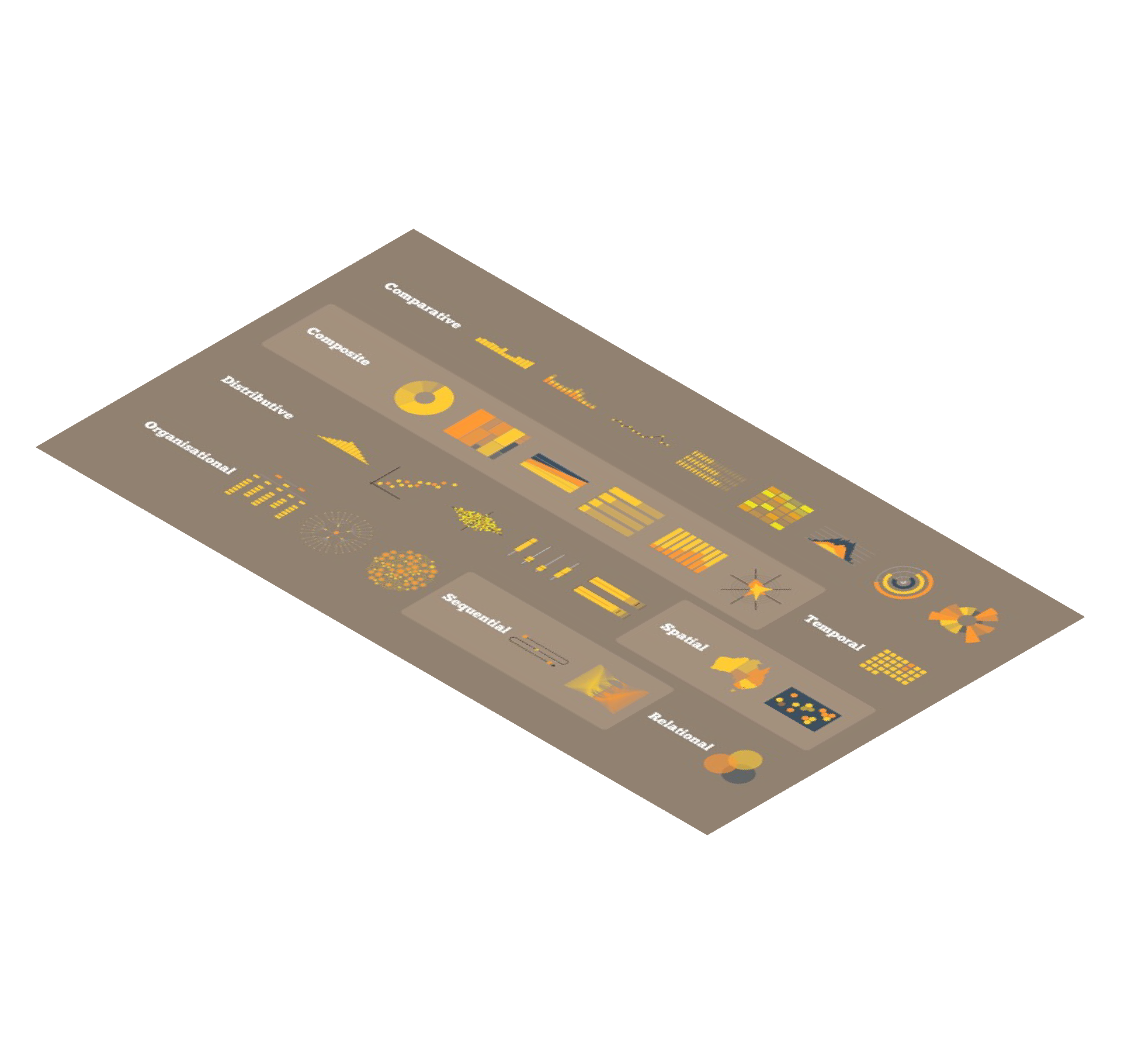
Learn data design & visual communication...
« Become a Visual Storyteller
The best in business intelligence...
The Analyst’s Toolkit
Enjoy a new level of creativity. You’re one step closer to being an artist and a designer. Get access to the Toolkit today.