


Wir haben eine Liste interaktiver Datenvisualisierungen zusammengestellt, die Ihnen hoffentlich als Anregung dienen, es selbst zu versuchen. Mögen Ihre Daten nie langweilig sein.

Der Data Analytics Conferences Guide 2024/2025 ist Ihr One-Stop-Shop für Konferenzen, zu denen Sie tatsächlich gehen möchten. Das sind tolle Konferenzen in coolen Städten.

Sehen Sie sich den Leitfaden 2024/2025 zu den besten Datenvisualisierungskonferenzen in Nordamerika, Australien, Asien und Europa an. Nutzen Sie den diesjährigen Konferenzführer als Reiseplaner. Gehen Sie also raus, reisen Sie, lernen Sie neue Leute kennen und erfahren Sie mehr darüber, was die Datenvisualisierung zu einem so kreativen und interessanten Arbeitsbereich macht.
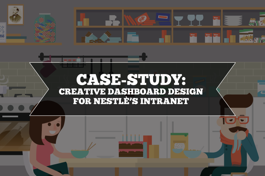
Ziel von Nestlé war es, ein benutzerfreundliches, visuell ansprechendes Erlebnis zu entwickeln, das den Nestlé-Mitarbeitern die Arbeit erleichtert und somit mehr Freude bereitet. Die Datalabs-Agentur entwarf und entwickelte daraufhin ein unterhaltsames Intranet-Portal.
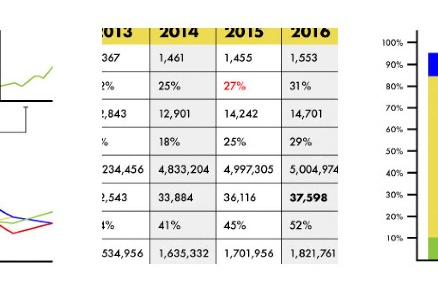
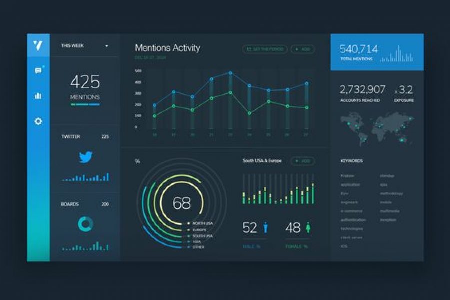
Verwenden Sie keine Tabellen mehr in Ihren Berichten. Im Ernst, es gibt bessere Möglichkeiten, Daten zu visualisieren. Hier sind drei: »
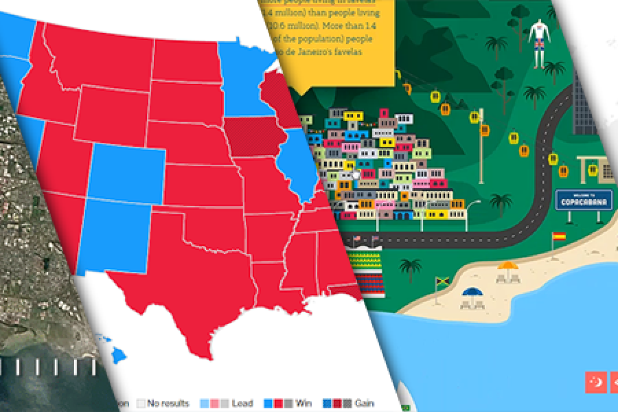
Das Datenvisualisierungsformat des Jahres (Zweitplatzierter): Die interaktive Karte Mit Best-Practice-Beispielen Vielleicht haben Sie schon gesehen, dass der Gewinner des diesjährigen Formats für das beste Datenvisualisierungsformat gekürt wurde: Der interaktive Rechner.
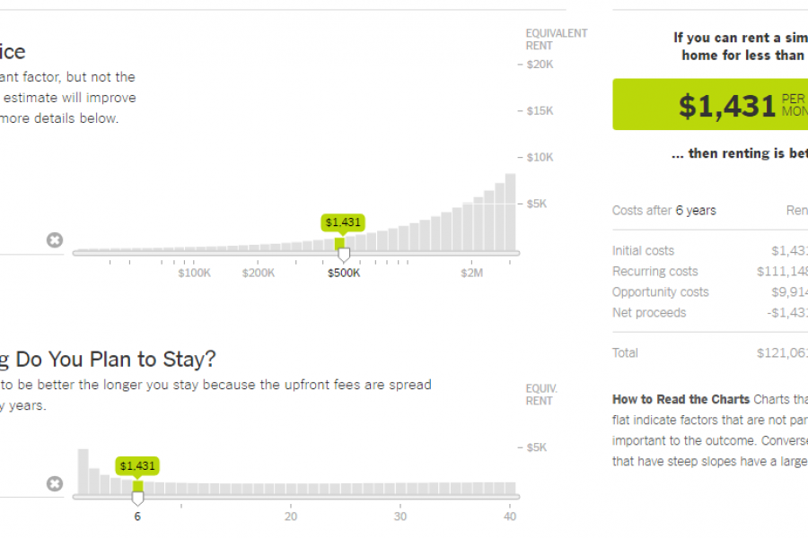
Das Datenvisualisierungsformat des Jahres: Der interaktive Taschenrechner Ein großartiges Beispiel, um Ihnen zu zeigen, wie es gemacht wird In diesem Jahr gab es einige großartige Datenvisualisierungen. Von interaktiven Karten über
Sehen Sie sich 3 großartige Tipps zum Entwerfen von Dashboards an. Lernen Sie den strategischen Ansatz zur Visualisierung Ihrer Daten durch Dashboard-Systeme kennen, die für Menschen entwickelt wurden.

Sechs Gründe, Ihren Mitarbeitern ein Skills-Training zu schenken Die Vorteile für Einzelpersonen und Unternehmen als Ganzes Wir bei der Datalabs Agency glauben fest daran, großartige Leute einzustellen und sie weiterhin

Datenvisualisierungs-Websites – 101 der besten Ressourcen Ideen, Inspirationsblogs, Menschen, Tools und mehr! Wir haben uns auf die Suche gemacht, um Ihnen 101 Websites zur Datenvisualisierung zu präsentieren, die die besten
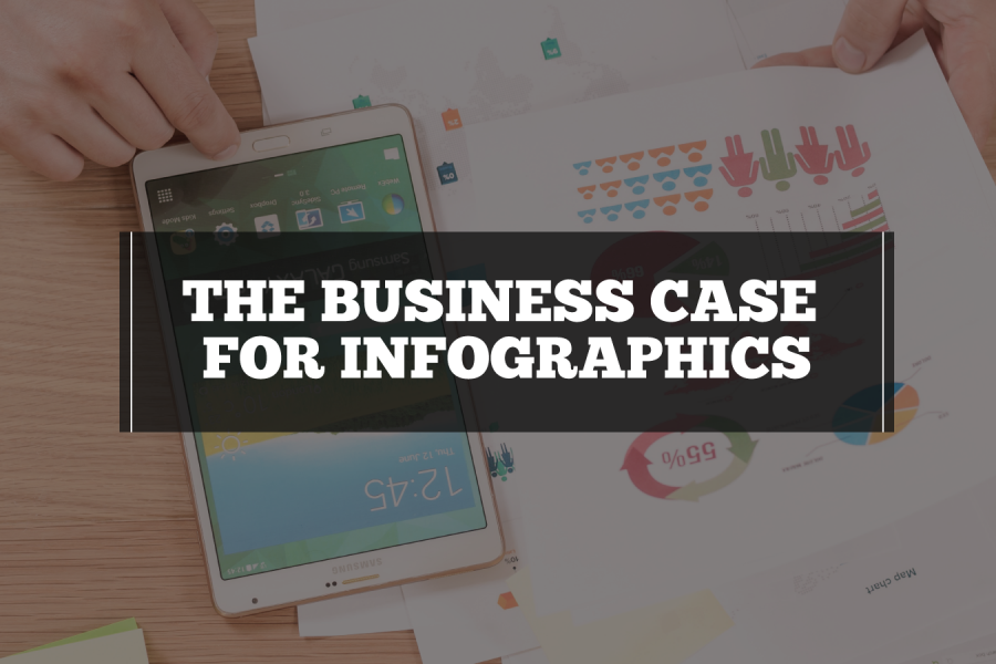
Was ist der Business Case für Infografiken? Wie Sie den Wert einer besseren Kommunikation, eines besseren Informationsdesigns und einer besseren Berichterstattung unter Beweis stellen Ihr Unternehmen verfügt über Daten und
Monash Heath wünschte sich eine zeitbasierte interaktive Datenvisualisierung, um den Weg eines Patienten durch das Gesundheitssystem zu zeigen. Wir haben Adobe Illustrator, Excel, HTML, JavaScript und CSS verwendet, um dieses digitale Erlebnis zu schaffen.