

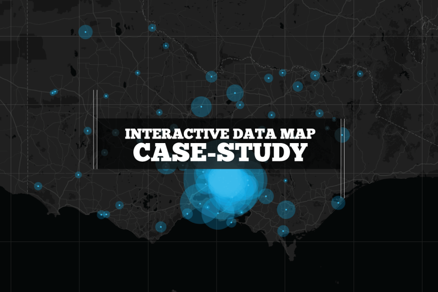
We built this interactive map as a use-case for interactive/explorable maps. It's UI and easy-of-use is a case study of how data visualization can make better sense of geographical data. Certainly better than a table in a spreadsheet!
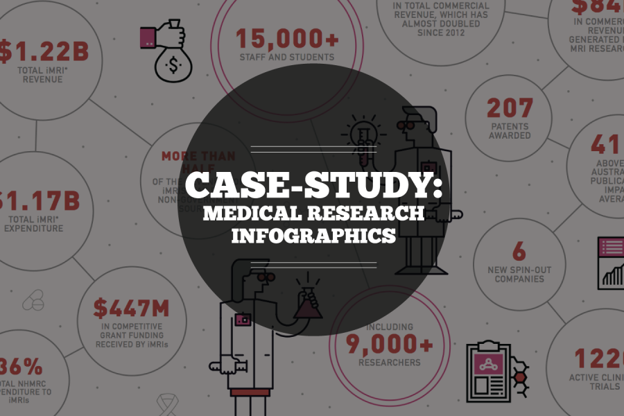
Case Study: Medical Research Infographic Who: Association of Australian Medical Research Institutes What: Summary Report Infographic When: August 2016 Why: The team at the Association of Australian Medical Research Institutes

Monash Heath wanted a time-based interactive data visualization to show the pathway of a patient’s journey through the healthcare system. We used Adobe Illustrator, Excel, HTML, JavaScript, and CSS to come up with this digital experience.
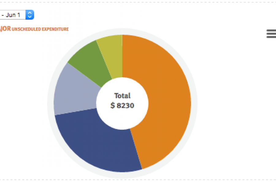
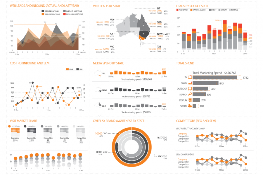
Financial Operations & Reporting BI Dashboards A Business Dashboard for Reviewing Financial Risk Our client offers vehicle fleet leasing and management, Australia-wide, and internationally. Their solutions are time-saving and cost-effective, as well
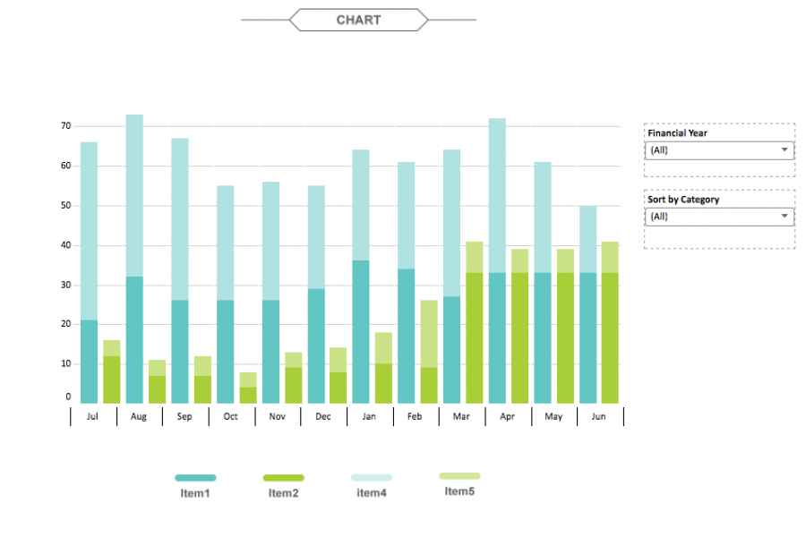
The aim for this project was to create an interactive dashboard, utilizing Tableau, to convey the data that had been collected over the financial year. Check out this financial firm's reporting suite.
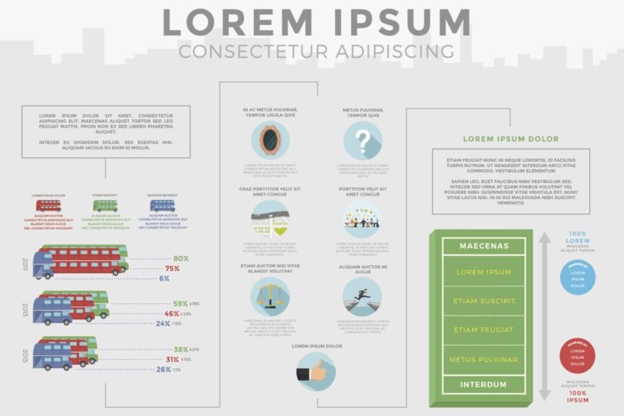
Case Study: A Long Infographic Report Design We recreated a long research report with an infographic style, using charts and graphs to convey the data they’d collected, over the period

Excel Data Visualization Artwork Project. Creating beautiful, artistic work exclusively in Excel. We were tasked by a digital agency to create something different for their client, using only the Microsoft product
A large Australian and New Zealand food manufacturer engaged Datalabs to visualize a set of survey results undertaken by their human resources department and an external consultancy. The result was this visually engaging infographic.
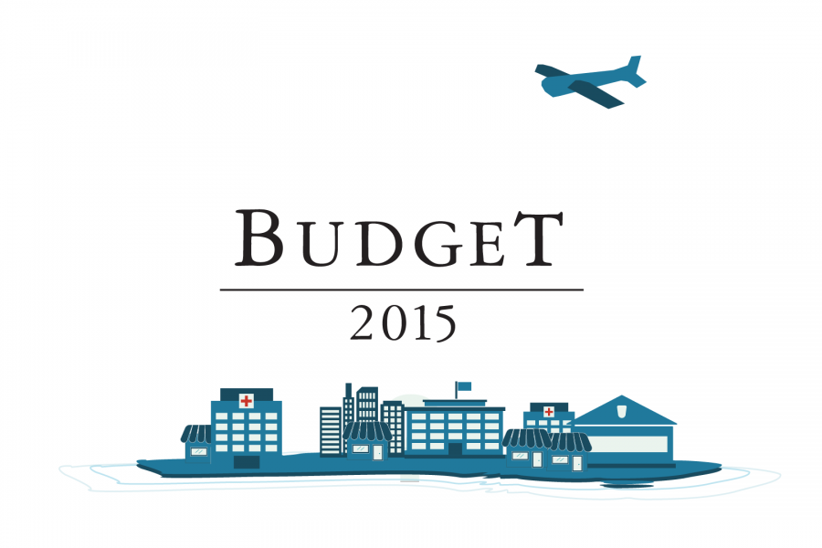
Datalabs is proud to show our work with the Federal Department of the Treasury for the 2015 Budget. Datalabs was hired in April to animate three videos, visualising the overview
With Datalabs’ help, at a Chief Marketing Officer’s level, reporting is now a unified dashboard — simple and insightful. An online healthcare and insurance company came to Datalabs with a
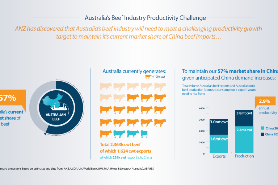
Recent work we completed for ANZ’s International & Institutional Banking division on China Beef. This animated data video leverages the data visualisation and infographic design work Datalabs’ team created and
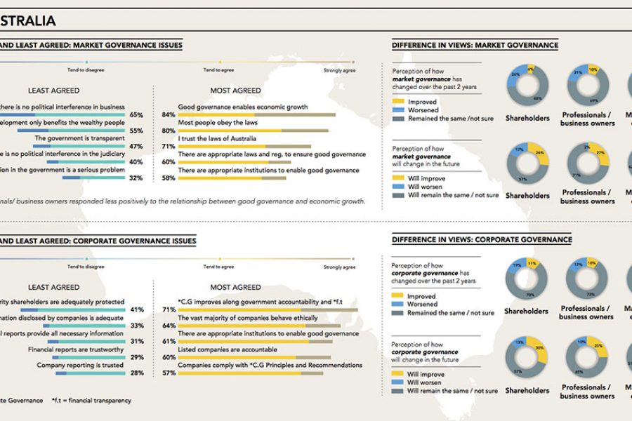
CPA Australia Infographics & Infographic Reports From data discovery to design Datalabs worked with CPA Australia to distill the insights from their Corporate Governance report on the Asian Pacific Region.