


What Makes A Great Year in Review? A list of our most favorite digital annual report content elements for 2017 Almost everyone produces a Year-In-Review and most of those still
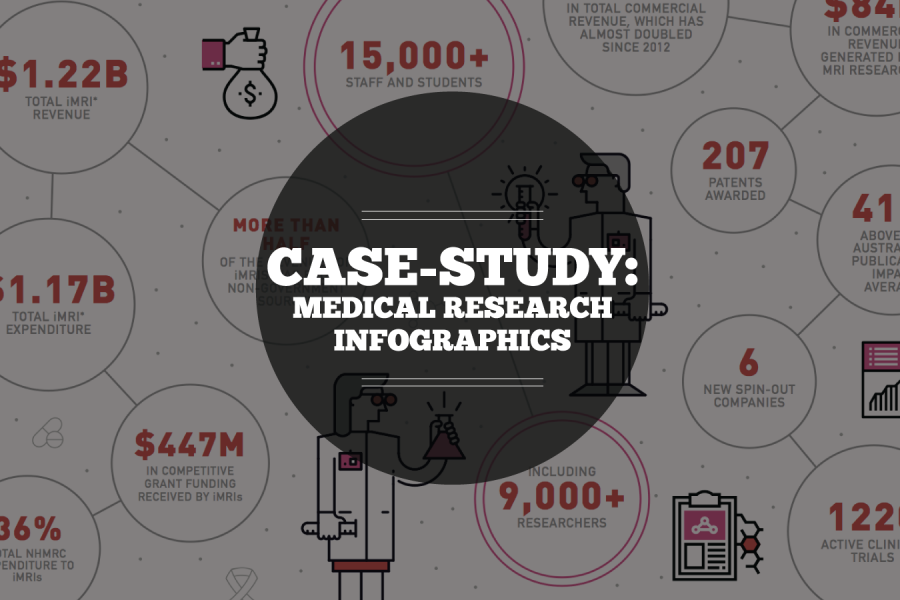
Case Study: Medical Research Infographic Who: Association of Australian Medical Research Institutes What: Summary Report Infographic When: August 2016 Why: The team at the Association of Australian Medical Research Institutes
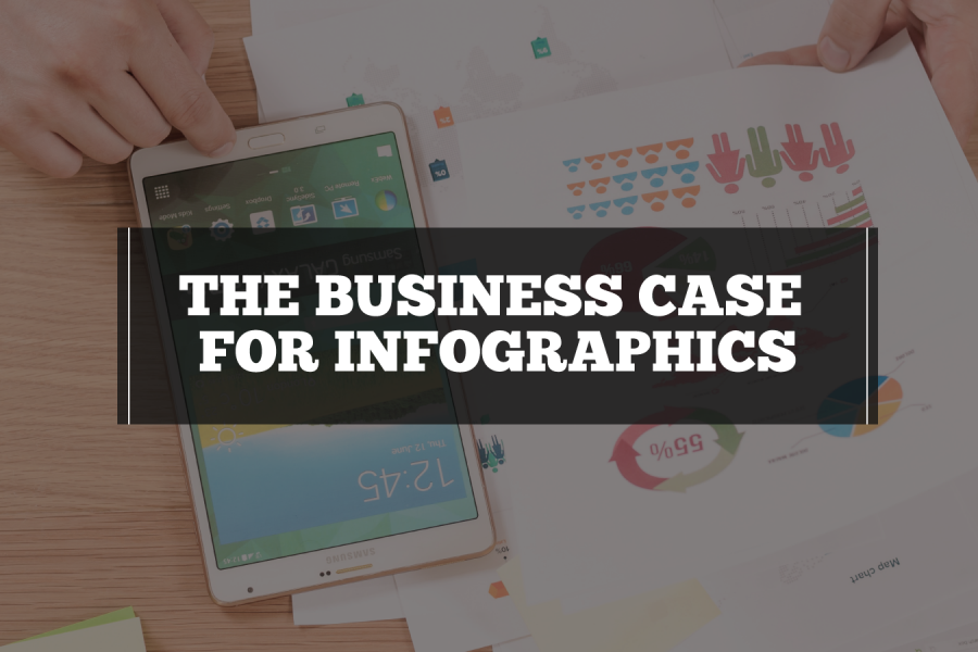
What Is The Business Case for Infographics? How You Prove The Value In Better Communication, Information Design & Reporting Your business has data and information. And your business needs to
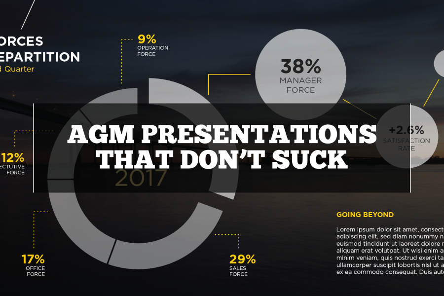
AGM Presentations That Don’t Suck The Best AGM Presentations Whether it be for shareholder relations, membership associations, chairpersons or a mix of everyone – Annual General Meetings exist to flaunt

Six Reasons to Gift Skills Training to Your Employees The Benefits to Both Individuals and Businesses as a Whole At the Datalabs Agency, we’re firm believers in hiring great people
Our List of Data Analytics Conferences for 2017 In today’s Age of the Internet data is everywhere – and every day brings more data. In fact, the amount of data readily
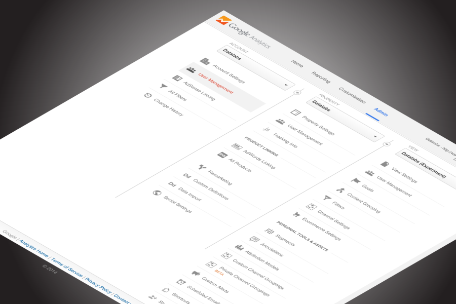
How To: Using Google Analytics as a Marketing Tool and Ultimate Decision Maker How to use Google Analytics We all know of Google Analytics, but ‘How to Use Google Analytics’
Digital Marketing Dashboards & Systems Visualizations The Common Digital Marketing Problem No matter what industry, we’ve heard the same underlying problems in our clients’ marketing operations. Key questions that could

Do You Know What Your Digital Marketing System Looks Like? (Like, physically, looks like?) Imagine a Network of Veins, Valves, and Organs — all labeled for clarity, informing everyone who
Six Questions Content Marketers Should Ask of Their Google Analytics Data Understanding the Value and ROI of Content is Imperative to Modern Marketing Analytics. Here are some great ways to
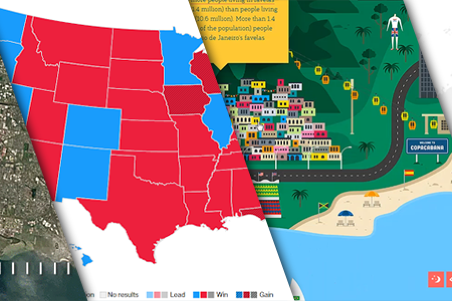
The Data Visualization Format of the Year (Runner Up): The Interactive Map With best-practice examples You may have already seen that this year’s best data visualization format winner was declared:
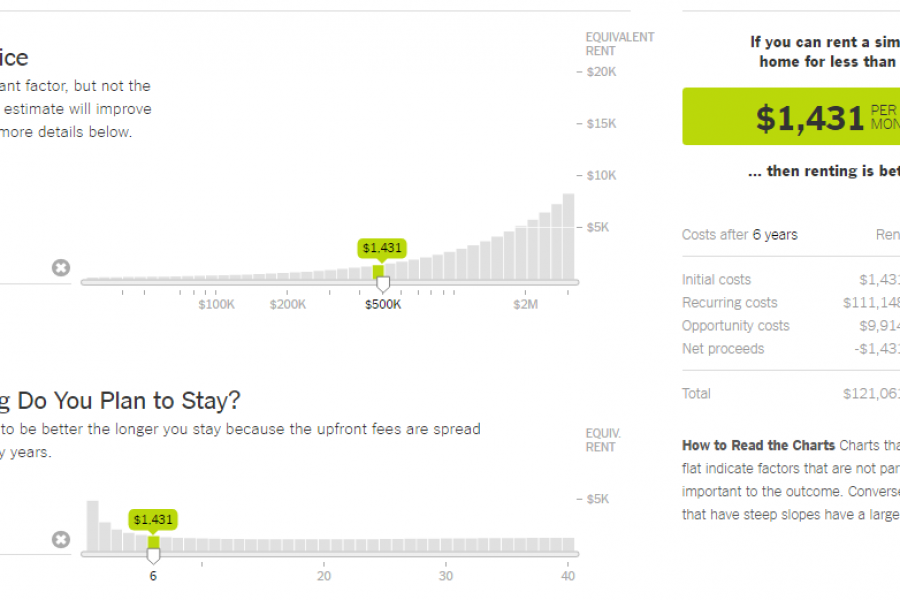
The Data Visualization Format of the Year: The Interactive Calculator A Great Example to Show You How It’s Done This year has seen some great data visualizations. From interactive maps,