


Our Opinion On Pie Charts …or the Case For and Against the Pie Chart. If there’s a list of controversial charts types in this world, then assume the pie chart

The Best People to Follow on Twitter for #DataViz We’ve gathered a list of 20 of our favourite data-viz people to follow on Twitter. Twitter is a pretty magical place.
Our List of Data Analytics Conferences for 2018 If you haven’t already seen it, our guide to your year of data viz conferences for 2018 is up now. And while there
Find Out What’s On at Tableau Conference 2017 Welcome to the Tableau Conference 2017! Starting Monday, October 9, thousands of data people will gather at the Mandalay Bay in Las
2017 Summed Up in 10 Revealing Data Viz and Infographics A list of some of our favorite visualizations that explain the year that was 2017. 2017 was an interesting year,
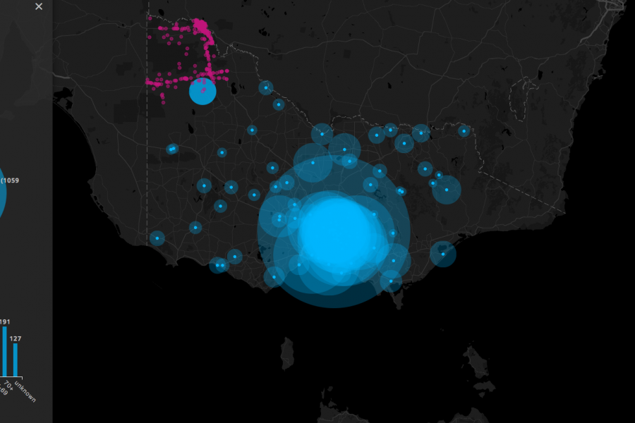
Three Interactive Data Maps Data-driven, Interactive & Animated If you’ve ever spoken to onto the DL team about a project there’s a fair chance we’ve tried to get a map

Data Visualization Websites — 101 of the Best Resources Ideas, inspiration blogs, people, tools, and more! We’ve searched and searched to bring you 101 data visualization websites that showcase the
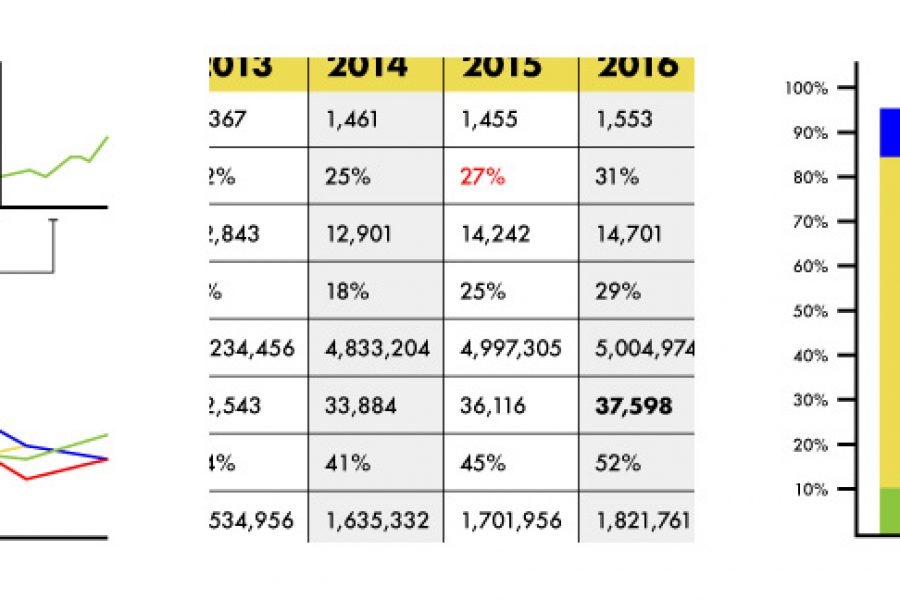
3 Alternatives To Using A Data Table Stop using tables. Seriously, there are better ways to show data. Here are three: When we run our data visualization workshops we run an
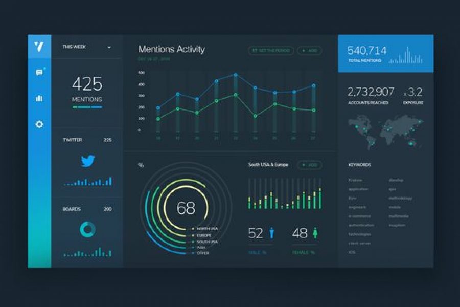
3 Pro Tips for Great Dashboard Design A strategic approach to visualizing your data through dashboard systems for humans. Here at Datalabs, we eagerly await the day computers gain sentience,
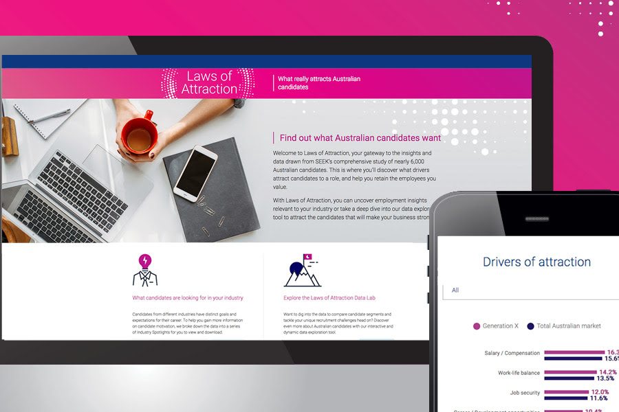
SEEK Laws of Attraction Find out what Australian candidates really want What attracts people to apply for a job or work for a company has changed. Where salary and job
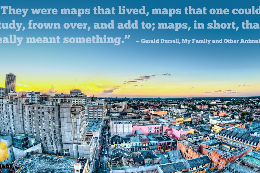
Data Stories & Map Design A look at how maps can help tell your data story Humans have used maps to share information about the world around us for over
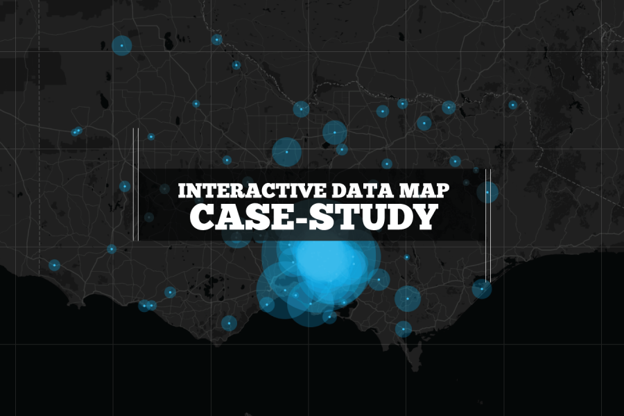
We built this interactive map as a use-case for interactive/explorable maps. It's UI and easy-of-use is a case study of how data visualization can make better sense of geographical data. Certainly better than a table in a spreadsheet!