

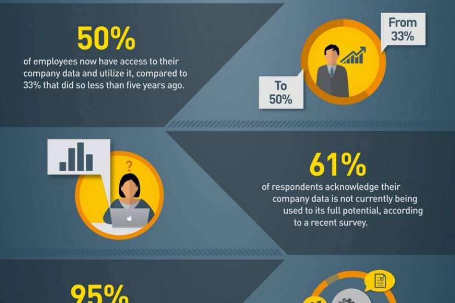
Big Data Infographic Report A recent report by SAP finds that the so-called power of Big Data has yet to be unlocked by decision makers. Datalabs has designed an infographic

The Need for Content Marketing Analytics You’ve probably heard it before but I’m going to say it again: there’s no point in creating content if you don’t have a way
Editor’s Note – We’ve got an updated list with 2016’s the new dates and other great events here: Data Visualization Conferences 2016 With the new year coming up, and new travel budgets
What is the Business Case for Data Visualisation? Data is ubiquitous these days, but it wasn’t always that way. Data collection used to be limited to hand-written records and/or oral

The Need For Data Visualisation Skills In Business A guide to skilling-up your employees An SAP-sponsored survey recently questioned business leaders about their opinions regarding the uptake and effectiveness
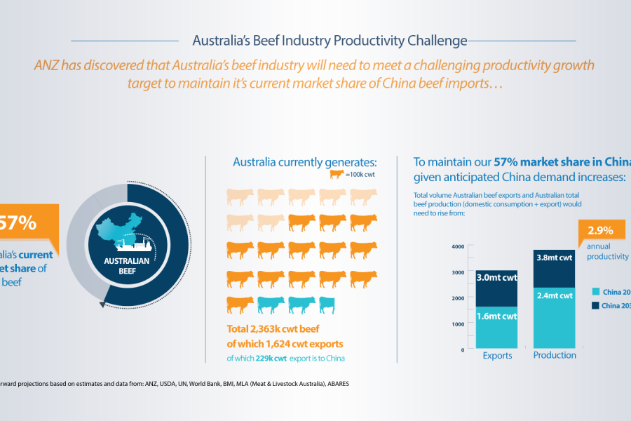
Recent work we completed for ANZ’s International & Institutional Banking division on China Beef. This animated data video leverages the data visualisation and infographic design work Datalabs’ team created and
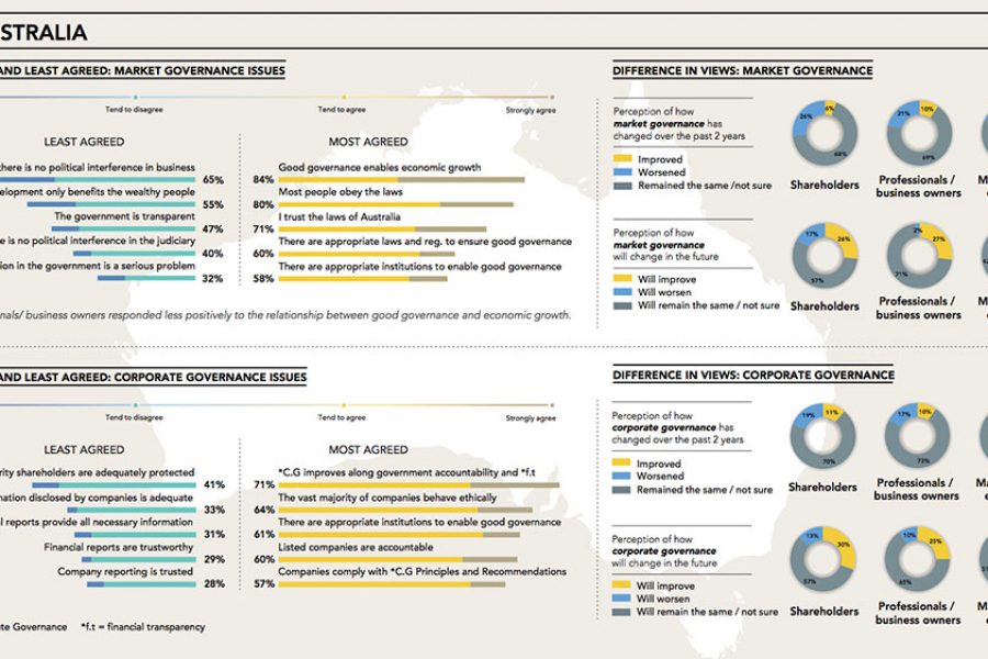
CPA Australia Infographics & Infographic Reports From data discovery to design Datalabs worked with CPA Australia to distill the insights from their Corporate Governance report on the Asian Pacific Region.
Xero Infographic Report Designed by Datalabs At Datalabs, we create data visualisations for a range of clients and business types. We love what we do, but we can’t help but

There's plenty of software to muck around with data, but to gain the skills to really get something out of it, that takes time and experience. Mikio Braun, a post doc in machine learning, explains . For a number of reasons, I don’t think that you cannot "toolify" data analysis that easily
When I meet with people and talk about our work, I get asked a lot what technology we use to create interactive and dynamic data visualizations. At Interactive Things, we have a set of preferred libraries, applications and services that we use regularly in our work. We will select the most fitting tool for the job depending on the requirements of the project
All industries have a critical need for visual analytics. The insights that can come immediately from a well-designed business dashboard or data visualization in the finance industry could provide the
We’ve compiled a small list of conferences definitely worth visiting in 2013. Events like this are a great way to see, learn, connect and be inspired. If you’re lucky enough to get a ticket, be sure to let us know so we could meet up and have a chat.