TABCORP

Tableau Style Guide Project

0
DATA
Consistent data design & style
0
REPORTING
A better way of looking at data
0
TABLEAU
Getting the most of Tableau
PEER INTO THE TABLEAU STYLE GUIDE PROJECT
See More of the Tableau Style Guide Project

Images from the project

Style & Structure

Brining together UI, data & design into one Tableau Brand Guideline

What – In December 2018, Tabcorp approached Datalabs to see if we could help them define a style for their business intelligence platform, Tableau. They were about to launch a large program of work in Tableau and they asked if we could help marry up their corporate and reporting design look and feel from the marketing & brand side of the business into Tableau.

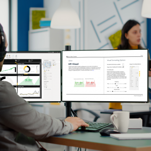
Why – After developing several dashboards and reports in Tableau, they found that the data manipulation and aggregation work was being easily transferred into Tableau but the overall look and feel wasn’t up to modern UI design standards. In particular, they had issues with navigation and understanding how a system of dashboards worked together, as well as chart selection.

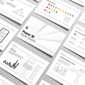
There was a request that if they were to keep going on Tableau for communications and internal reporting to the wider company, rather than just within a team of analysts, then they would need to have a style guide that would help them unify the design elements and help the user interact with the data.

How – Datalabs were engaged to develop the Tableau Style Guide (including charts, best practice, font usage, layouts, colours etc) and provide some ad hoc development and training in terms of templates and two workshops to help train the team on the use of the guide. Once the team project had been brought up to speed they would be able to train and support the wider group.

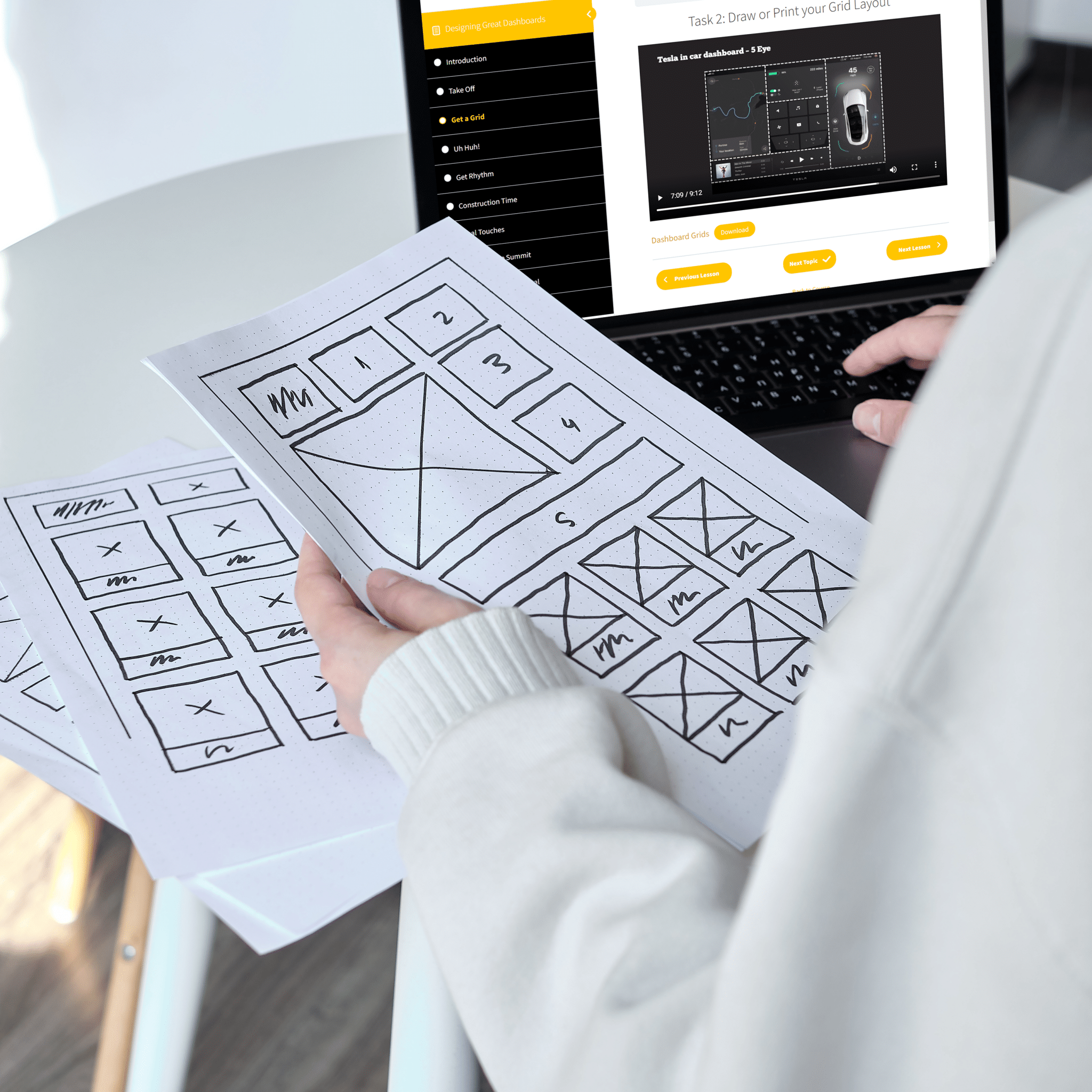
Within the scope we included navigation options, using filters, using tooltips, how to use a landing page to introduce a dashboard, general UI plus common data visualisation best practice and how to use common stories.

Along with these we also have our best use of charts and setting up Tableau to be more user-focused, cleaner design, and better at delivering their data.

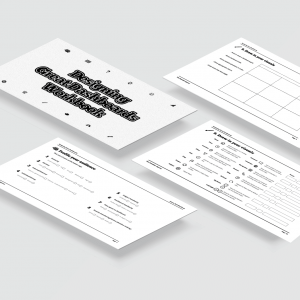
Delivered – Tableau style guide, custom theme, design templates, icon set.

Pair It With Dashboard Training!

-49% Sale!
Image
Image
Image
Image
Finally, a course that shows you what you need to know.
$45
An all-in-one package containing tools, guidance, and assets to design great dashboards
$900$3,900