

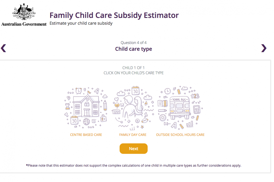
Die Datalabs Agency wurde beauftragt, dem australischen Bildungsministerium dabei zu helfen, eine saubere und einfache Benutzeroberfläche zu erstellen, mit der Eltern und Betreuer von Kindern die Höhe des ihnen zustehenden Geldes abschätzen können.
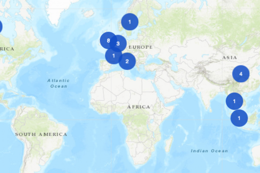
Ein interaktives Mapping-Projekt für die Business School der University of Melbourne. Diese interaktive Karte zeigt ehemalige Studenten, Dozenten/Absolventen, Programme und Partnerschaften, mit denen sich potenzielle Studenten auf der ganzen Welt
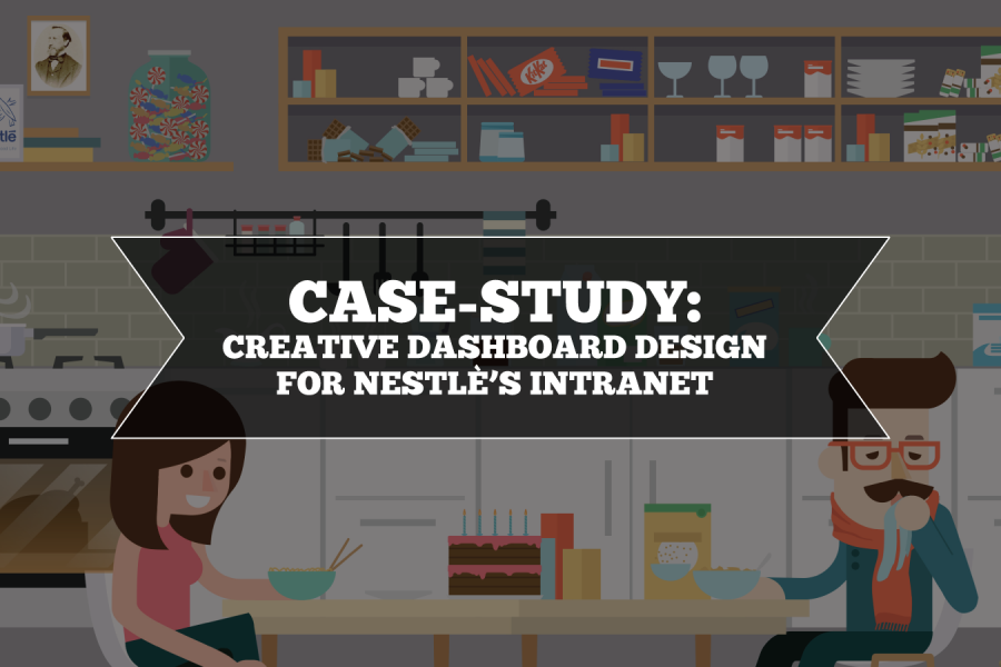
Ziel von Nestlé war es, ein benutzerfreundliches, visuell ansprechendes Erlebnis zu entwickeln, das den Nestlé-Mitarbeitern die Arbeit erleichtert und somit mehr Freude bereitet. Die Datalabs-Agentur entwarf und entwickelte daraufhin ein unterhaltsames Intranet-Portal.

Das Ministerium für Bildung und Ausbildung benötigte eine saubere und einfache Benutzeroberfläche zur Unterstützung der Kommunikationsstrategie für das neue Kinderbetreuungspaket der australischen Regierung. Dieses interaktive Tool war ein Hit bei den Eltern, die ein paar Zahlen brauchten.
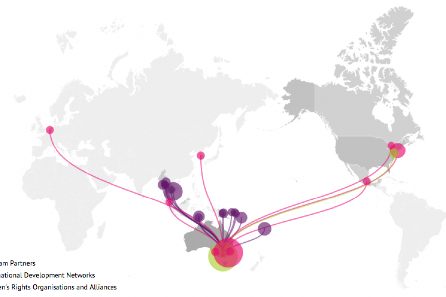
Sie möchten wissen, was die Datenvisualisierung für Ihre Website leisten kann? Sehen Sie sich dieses Live-Beispiel einer interaktiven Karte an, die für die International Women's Development Agency entwickelt wurde.

Wir haben eine Liste interaktiver Datenvisualisierungen zusammengestellt, die Sie hoffentlich dazu inspirieren, es selbst zu versuchen. Mögen Ihre Daten nie langweilig sein.

Vom gefürchteten Kreisdiagramm bis hin zum oft missverstandenen Sankey-Diagramm werden wir uns mit weiteren Anleitungen zur Datenvisualisierung beschäftigen und diese Liste der Kategorien und Typen aktualisieren. Setzen Sie also ein Lesezeichen auf diese Seite, und melden Sie sich für unseren Newsletter zur Datenvisualisierung an, damit Ihr Gehirn für das Datendesign gut versorgt ist.

Die Verwendung von Wiederholung, Ausrichtung und Symmetrie bei der Gestaltung von Datenvisualisierungen Wir sind am Ende unserer Serie über die Grundsätze der Datengestaltung angelangt. In diesem letzten Beitrag wollen wir

Sehen Sie sich den Leitfaden zu den besten Datenvisualisierungskonferenzen in Nordamerika, Australien, Asien und Europa an. Nutzen Sie den diesjährigen Konferenzführer als Reiseplaner. Gehen Sie also raus, reisen Sie, lernen Sie neue Leute kennen und erfahren Sie mehr darüber, was die Datenvisualisierung zu einem so kreativen und interessanten Arbeitsbereich macht.

Der Data Analytics Conferences Guide 2023/2024 ist Ihr One-Stop-Shop für Konferenzen, die Sie tatsächlich besuchen möchten. Das sind tolle Konferenzen in coolen Städten.

Grundsätze der Datengestaltung: Wiederholung, Ausrichtung, Symmetrie Wir sind am Ende unserer Serie über die Grundsätze der Datengestaltung angelangt. In diesem letzten Beitrag wollen wir die grundlegendste Frage stellen: Was genau
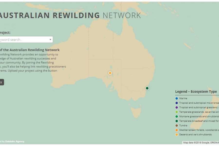
Mit einer interaktiven Karte auf ihrer Website hat Rewilding Australia die Anzahl der interaktiven Medien auf ihrer Website verzehnfacht. Sehen Sie sich die kartografische Erfahrung an.