The Datalabs Agency has NEWS!
Online Data Visualization and Storytelling Course Launch
Hello, data friends!
We’ve been working hard behind the scenes, and are now super, super, supremely excited to finally share the news …
Ready to hear it!? So, it’s our very first, fully online, fully on-demand data visualization and storytelling course, formed through years of experience and learning, that we at the Datalabs Agency have compiled into succinct videos, exercises, examples, proven processes and more. And it will train… and inspire… and improve… and it will…
Apologies, please give me a second to catch my breath.
Let me start from the beginning to give you some context and explain why we’re so excited and, frankly, proud.
P.S. We’re that excited that we’re also offering some big discounts for our first users which we’ll be sending out in the form of discount codes when we launch. You can secure your discount code below.
But back to our story…
What Almost a Decade of Data Visualization Has Taught Us
See, since we started out as a data design agency almost a decade ago, our team has worked on a whole slew of data projects focused on getting data communicated in an effective, useful – and an inevitably visual way.
Complex BI dashboards and systems, data animations, marketing infographics, software designs and prototypes, interactive annual reports, entire visual strategies … you name it.
And yet regardless of the client who needed these projects (from start-ups to government and NFPs, to the likes of Nestlé, eBay, Marriot, Mercedes Benz and more), our team saw the same pain points in almost every organization, uncovering the fundamental reasons they reached out for our assistance to begin with:
They often had so much great data to work with, but that fact almost acted as a blocker … posing more questions to them rather than answers.
Where do we even start? How do we continue sustainably through a large data project? What do we do if we hit a roadblock?
Another big one was:
How do we cut through the thousands of rows of data that we have to communicate the real insights – fast? How do we decide what’s crucial to include versus what should be cut to avoid overloading the reader or losing the true meaning?
(I’ll let you in on a secret: Often, this was only difficult for them to distinguish because they didn’t first decide what that true meaning was. Who is it for? What are you trying to tell them? What do you want them to do about it? These are important questions to know the answer to before you start ANY communication project, and all part of the process toward successful data viz.)
And then there is the other common concern:
We know the data back to front, but we’re not designers. How can we turn our data into a design that people outside our department can understand? And how do we make it look good and professional and keep our audience engaged? We just don’t think we have the creative bones in our bodies to do all that.
We heard it all, and we heard it often.
So, as the helpful, problem-solving people we are, we’d take all these concerns off their hands and dive straight in to plan, design and often execute their data project.
And it was great! They loved it. We loved it. Their users loved it!
… And then a few months later they’d come back for another project. Perhaps an internal dashboard this time, or maybe their annual report. And then another project… and another.
Each time, we’d use the same processes. The same checklists. The same tricks and techniques that we knew delivered great data viz.
Of course, nine times out of ten, our clients would hands-down know more about their data, more about their business, its context and their audience than us – they’d lived it and breathed it for years.
Obviously, they’d spend time with us to brief us … but what if they didn’t need to? What if they didn’t need us for their project at all because we could help them in a much more lasting way?
And then it really got us thinking …
Imagine how efficient it would be for them if they knew the very same processes, the checklists, the tricks and the techniques themselves. How powerful would their teams be when they could apply this not only to the large projects they are able to outsource – but also their everyday work?
The Datalabs Agency’s Intro to Data Visualization and Storytelling Workshop was Born
Five years ago, we launched our very first face-to-face data visualization workshop: ‘An Introduction to Data Visualization: Tools & Techniques’. Today, we offer almost 20 specialised workshops catered to industry, formats and even software. And we’ve flown all over the world to train government groups, scientific and medical groups, corporate teams in analytics, marketing, media, design, and the c-suite alike. We share our tried and tested processes and break it down in a simple and digestible way – avoiding unnecessary technical jargon and focusing on the design thinking methodologies that lay at the heart of making sound visual communication decisions.
And, how can I say this without sounding smug… time and time again it’s worked!
Here’s what a recent attendee of our data visualization workshop had to say,
This workshop provides a clear and concise introduction to data visualisation. The time you invest will be rewarded with knowledge and skills that you can apply immediately to your work.
– Gail Smyth, Department of Education and Training, Australian Government
Thanks, Gail.
And while our face-to-face workshops have been a huge success for us and our attendees, they haven’t catered to every individual who was interested in boosting their data viz game with us. Logistical blockers. Not enough people. Waiting for next year’s training budget to be allocated. Hey, things don’t always work out.
Unless…
Ask (for accessible data viz training) and You Shall Receive
We often heard from self-starter individuals who identified the need for themselves, but perhaps not for a whole team. People that wanted to upskill themselves outside of their workplace and on a schedule that would suit them.
So, again, being the very helpful bunch that we are, we put ourselves up to the challenge to transform our face-to-face workshops into a digital learning experience. One that can be completed at your own pace and even in your own home, or at your favourite cafe or on the train to work. And we’re almost there, folks!
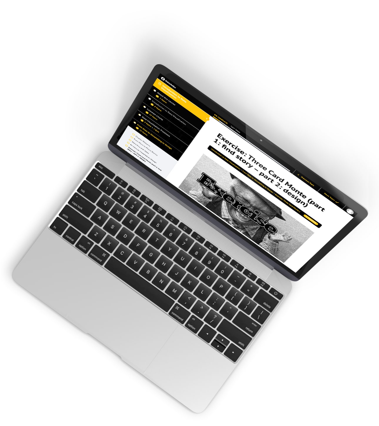
Starting with the fundamentals (and with our most popular workshop), we’re extremely pleased to announce that our first workshop-turned-online-course will be ‘An Introduction to Data Visualization and Storytelling‘.
The course is packed with everything you need to know about finding the stories in your data, working with charts, designing with data and successfully communicating to your audience in a visual way – take a look below:
‘An Introduction to Data Visualization and Storytelling’ course outline:
1. Intro to Data Visualisation – Learn the foundations of what data visualization is, how it came to be and how it’s used most effectively. Plus, get acquainted with the industry terms and understand the role of design thinking in data visualization.
2. Common Charts – Learn how to choose the right chart for your data and get to know with best practices for chart design and iterative design processes.
3. Data Visualisation Processes – Learn the holy grail of running a successful data viz project. We break down our tried and tested processes in a step-by-step format while providing tips, checklists and more so you can run a full data viz project with confidence.
4. From Data to Storytelling to Design – Put it all together and learn how to find the stories buried in your data cells, and how to transform this into an engaging and memorable visual output. We’ve jammed this chapter with loads of practical information-design tips that you can start using immediately.
5. Advanced Visualizations – Learn how to tackle multi-variable data and present it clearly. We’ll touch on dashboards, infographics, web and interactive experiences and more.
6. Data Viz Inspiration and Resources – Don’t stop here. Find out where to go next to continue learning, creating and gathering feedback. See who does it best and get inspired to push your own data viz designs even further.
And Here’s Why We Love It! (if we do say so, ourselves…)
● It’s built for EVERYONE
This course has been designed as the foundation of any future courses on the platform. If you work with data, we guarantee you’ll get something out of this. Whether you’re a marketer, designer, web developer, data analyst, public servant, corporate team member or otherwise, you’ll be able to take away practical skills to better communicate data in your day-to-day.
● You don’t need to be a data viz software wiz
You don’t need to learn a new software suite to use your new skills. You can apply the same processes, tips and techniques directly to paper or to the software that YOU ALREADY USE. Word, Excel, PowerPoint, Sketch, Canva, Illustrator, InDesign, PowerBI, Tableau. The learnings are relevant to all.
● You don’t need to be a designer
We already know that many of our workshop attendees initially felt uncomfortable with drawing and designing. So we put that at the forefront of our mind whilst developing this course, and it is not as tough nor daunting as you may expect. Throughout the course, we’ll build your confidence in putting pen to paper – which is a crucial part of gathering feedback and starting an iteration process.
Believe us, even a scribble gets you ahead. If you’ve ever tried explaining a visual concept without a visual reference, you’ll understand the difficulty. And you really can’t make any mistakes from trying.
● You DO have the time
We know you’re busy – that’s why we’ve been extremely conscious of your time while building this. Between theory and practical exercises, you can expect to complete the course in under 10 hours. Plus, we’ve broken it down into bite-size pieces, so it’s easy to pick up where you left off and take something useful away each time you do.
Even if it’s a simple tip like switching out your pie charts to donut charts for a sleeker design while adding space for more context to your data. Or knowing how to use color effectively in your data designs. Every topic will build your knowledge.
● Learn on the go – whenever and wherever you have an internet connection
Welcome to the 21st century. Use your computer, tablet or mobile device to upskill whenever you have a spare moment. Each topic will only take 5-10 minutes of your time. So you don’t need to block out a whole day to learn if that doesn’t work with your schedule. Of course, exercises will gradually get longer throughout the course as you build your skills to tackle more complicated data designs.
Plus, You’re In The In-Crowd!
We’re obviously really excited to share this with you. And as a thank you for following our journey, being data viz enthusiasts and for simply getting through this (quite lengthy) read, we’re offering a limited, introductory discount to our data viz family.
The discount is pretty substantial for our first batch of users, so if you’d like to get in on it, be sure to submit your email below so we can send the code your way.
You’ll also be the first to hear about future online data visualization courses that we release, which will go beyond the foundations to cater to specific industries, data viz formats and software and more.
Again, we can’t thank you enough for helping us become a better resource to both our clients and the wider data viz community. We’re keen to have the opportunity to give back in the form of accessible, affordable and practical data visualization and storytelling training (and as many virtual hugs as you’re heart desires)!
Thank you!


