


 3 Pro Tips for Great Dashboard Design
A strategic approach to visualizing your data through dashboard systems for humans.
Here at Datalabs, we eagerly await the day computers gain sentience, become self-aware and begin using us meat sacks for power generation and light-weight slavery/maintenance.
We welcome our robot overlords and will do their bidding willingly.
Until that time comes, we still need to keep us humans informed as to the goings-on within organizations. One way we do that is through the visual display of information. The Datalabs Agency team has designed dashboards within tools like Power BI and Tableau, in CRMs, custom interfaces, for intranets, and more. Throughout these projects, we’ve learned a few things about how to design a good visual interface.
What I’ve learned is that, to a professional dashboard designer, the actual design process is relatively easy. We can do that quickly. Really quickly: it’s actually very impressive. But it’s what we do most days of the week.
What I know now, after working on dashboard projects for a few years, is that success is not measured in the choice between a pie chart or a stacked bar (stacked bar usually wins btw).
It’s measured in the way the designers and developers understand who they are designing for and what they are really seeking to achieve. We’ll touch on the first one later, but the second point is this:
Designing for People is Complicated & Political
I make the point that understanding the greater purpose of why things need to be measured in a dashboard is not always aligned across all organizations/teams/groups of people.
That means when we develop a universal view of a metric or division or campaign, it will mean different things to different people. That’s simply a fact of how large groups with complex decision-making processes work.
To solve that in a simple dashboard is a challenge but to be aware of it and to make sure your design purpose is clearly communicated and reiterated across all levels is key.
Remember that people are often afraid to say they don’t understand, or challenge a more senior team member on something in a group.
*Tip one:* Design each view, metric, and module with a clear persona and revisit that with the group and individuals throughout the process to make sure it aligns – and don’t be afraid to challenge it/them to make sure it does.
Blending Data In Both Source and View
Dashboard re-designs are a great way to shine a light into all the dark corners of your reporting systems. You’ll see big scary metrics that have been coalescing in the dark for longer than you’ve been there. You’ll see thousands of little, insignificant metrics scurry out of the way when the lights flick on.
This is a good thing. I’ve been told before that our dashboard whiteboard sessions are cathartic experiences. They get things in the open, force discussion about what’s really relevant and they declutter other reports and ultimately, inboxes.
This is because we always look to question what is relevant, and then see if that stacks up against what else you can measure it against.
In these sessions, I talk about real estate on dashboards as the key commodity in its design. When designing dashboards we need to make sure that everything that gets in there has a clear purpose and is hyper-relevant to the user. Every dashboard has limited space to be effective and you need to be respectful of the users’ time and needs.
It needs to allow people to understand something that they didn’t have previously. It answers a simple business question and it’s a key driver of whatever the dashboard is doing.
*Tip Two:* Blend and compare metrics. Otherwise, a number in a spreadsheet would be enough. Do this by using timeframes, weights, averages, targets etc. If you always look to show things against others you get context for your data which is what really leads to insight.
 Understand your dashboard’s place in the system.
When we design dashboards we always look at the system overall. By systems we mean the things that control or flow into the metrics, data, reporting, analytics, and dashboards. These will be data sources such as CRMs or analytics data platforms such Google Adwords or Adsense; there will be physical aspects to the system such as humans, locations, divisions, reporting, people, targets, and finance.
Organizational reporting is complicated. The need to simplify it is obvious but trying to squeeze all this complexity into a dashboard(s) and hoping simplicity pops out the other side is unlikely, if not impossible.
We know that because we’ve tried.
I mentioned in the first tip that the understanding the person using the dashboard is a vital part of the process; I’d now like to add that giving the user context as to where they are within the system is also a great way to get more out of a dashboarding project.
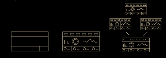
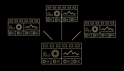
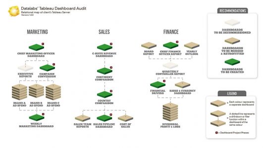
When we design dashboards, we start by mapping out the whole system and which dashboards will become part of the system. We call that the dashboard relational map.
It contains a diagram of the system, with a hierarchy of needs (say, if the primary need is to get the CEO a dashboard, followed by then the marketing division: that will be explained visually). This map feeds into the dashboard system and will be used as a simple navigation for the dashboards (we explain it like the small map in the bottom corner of a first-person-shooter – a quick reference as to where you are).
The reason we do this is for context. Making sure the user is always aware of where they are and where they are going means they are more likely to understand the whole system. By exposing it they have the awareness of their place but also when they go next. This means greater engagement with the data and so the likelihood of continued use and understanding is increased.
*Tip Three* – Understanding your system is complicated. Before you try and solve micro issues (i.e. charts, metrics) look at the macro. Draw out the system from top to bottom, bottom to top, and then look for the priorities and start to make decisions about the individual dashboards and what they contain.
That’s three things we know from experience that will help you build seriously better dashboards and reporting systems. They’re not simple, they require more skills than just design, development, data, and analytics. They need a good communicator that is equally curious about the data and the design. Someone who understands the data well enough but doesn’t get lost in it.
Thanks for reading. If your still interested these might be of interest:
Part Two: will cover how to transition from paper and Excel reports, your dashboard’s place in the analytics value chain, and more on the micro, macro, and meso levels of dashboard design.